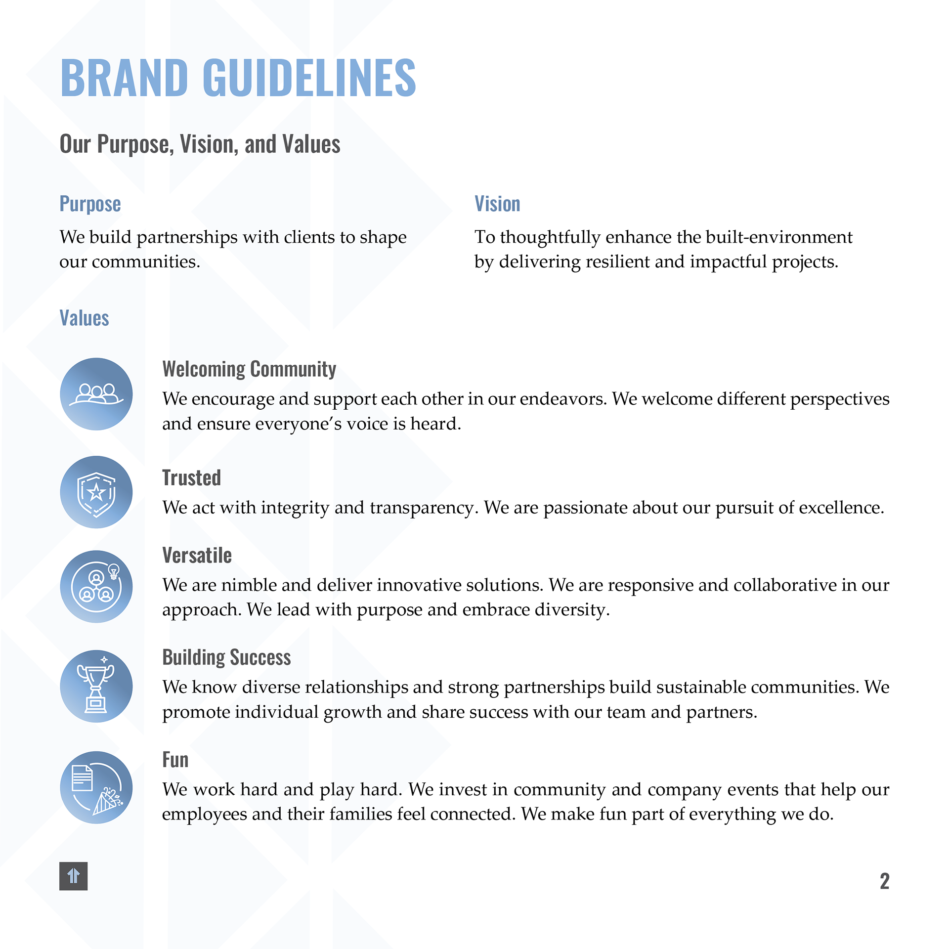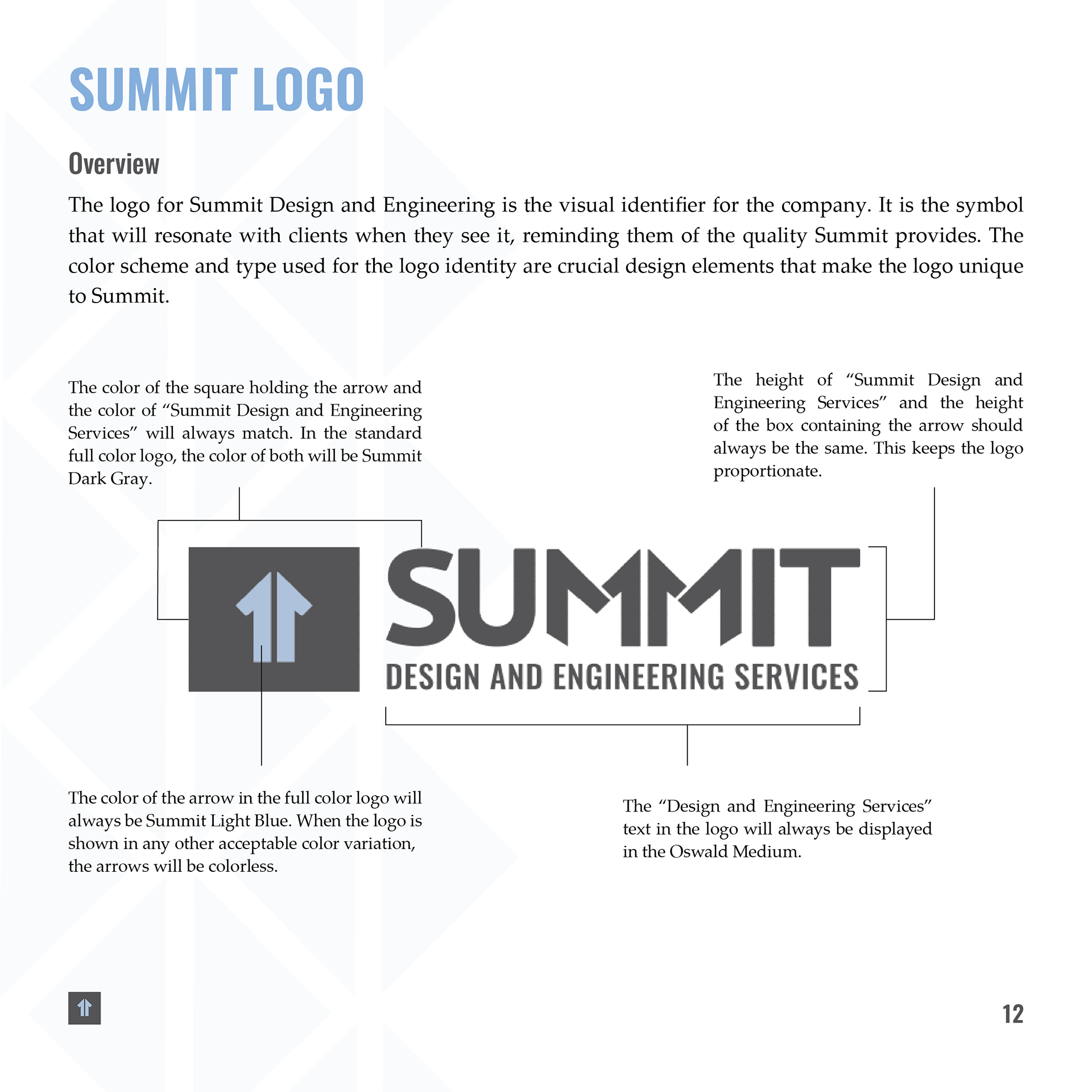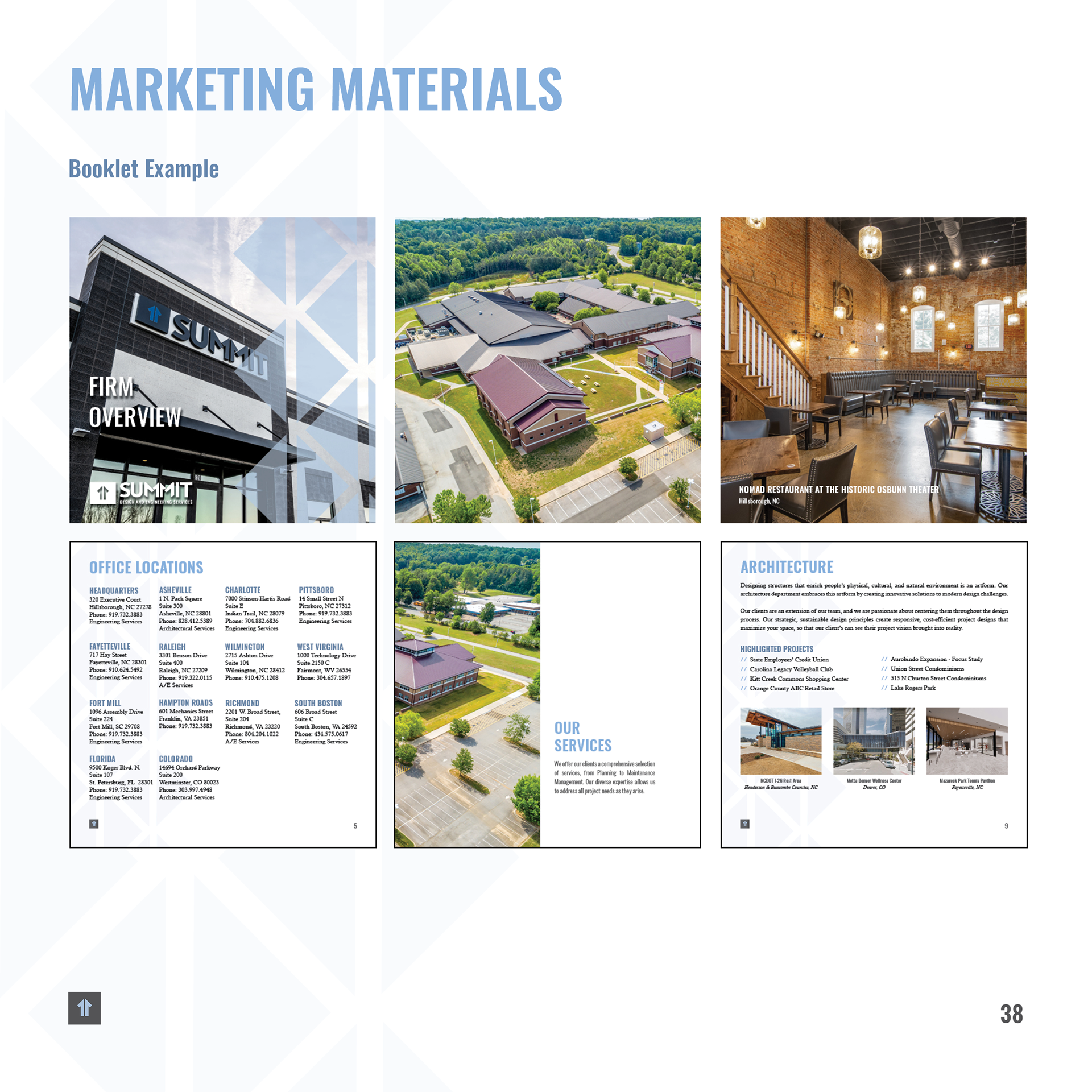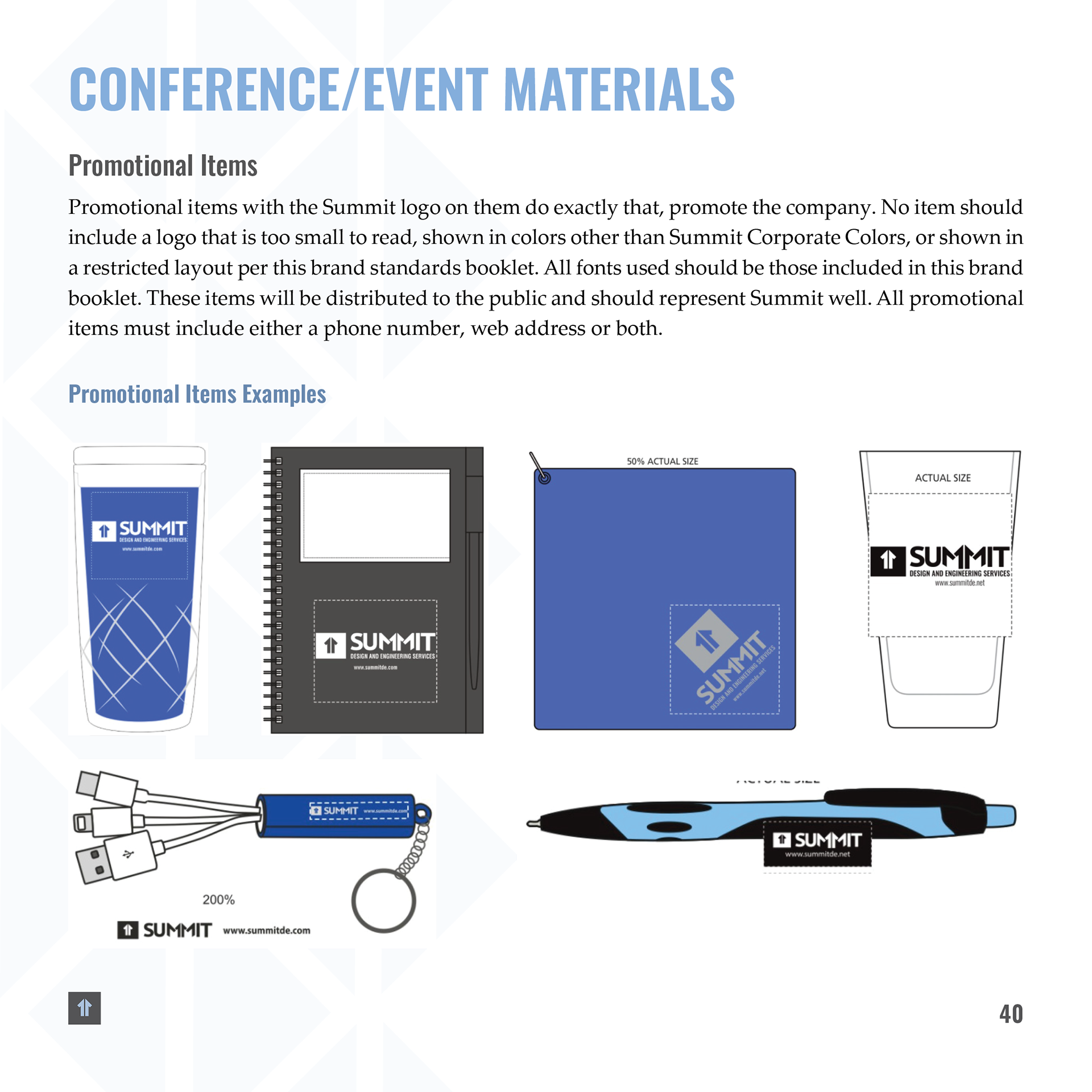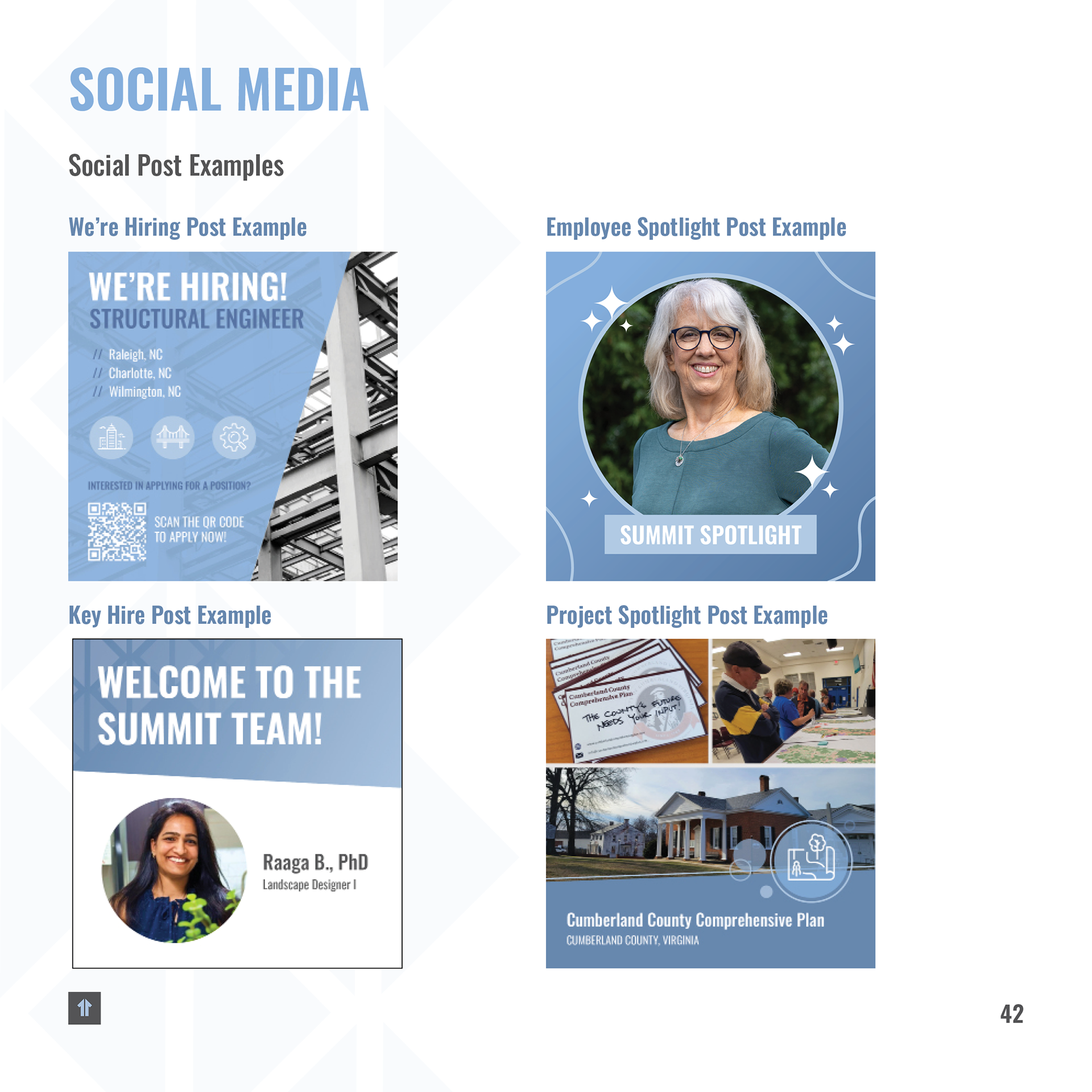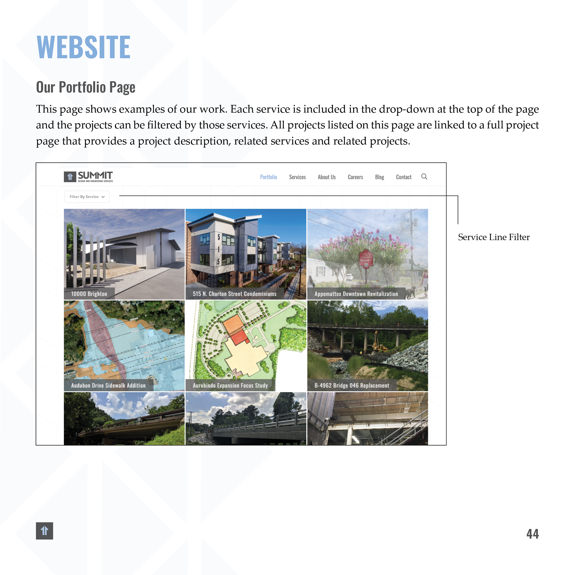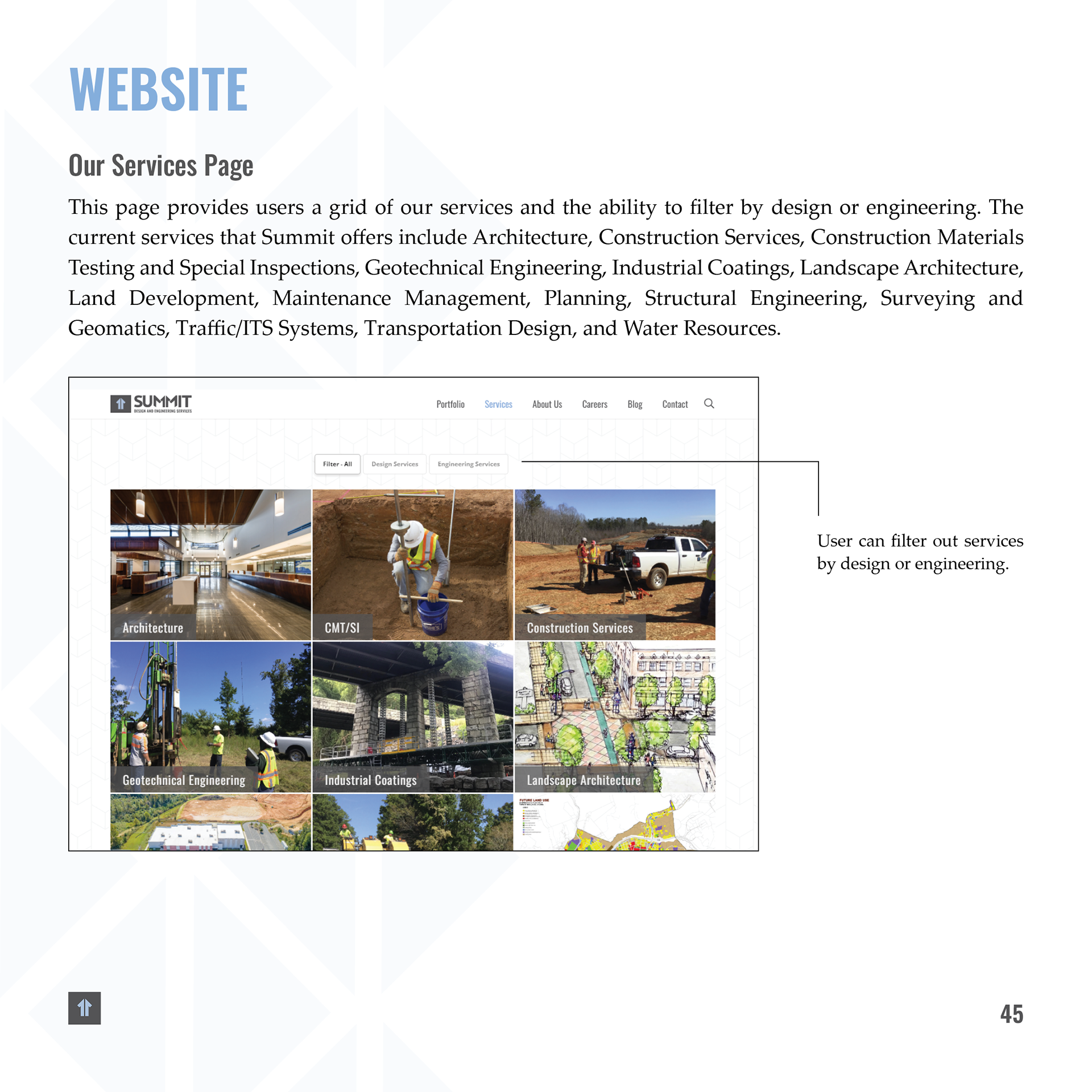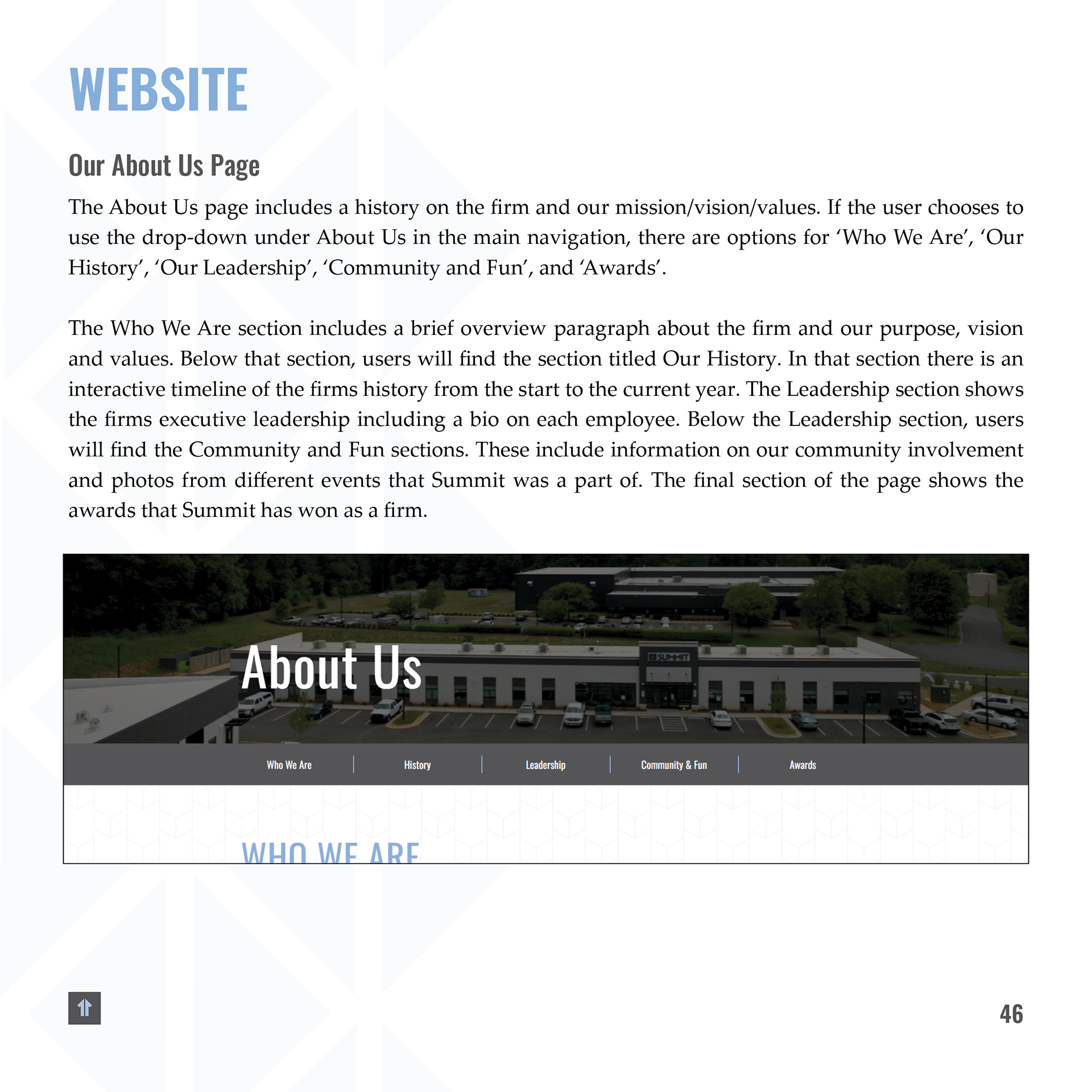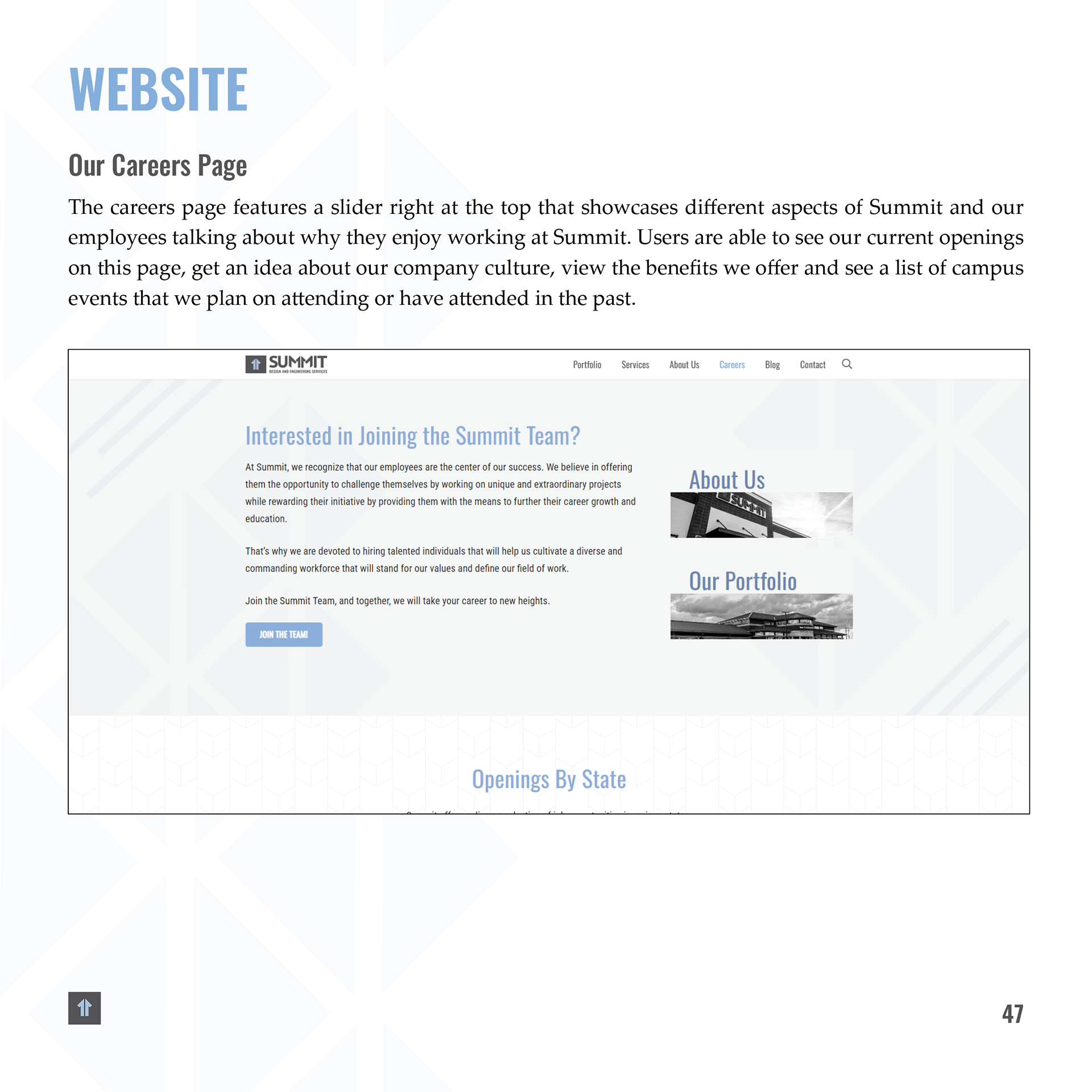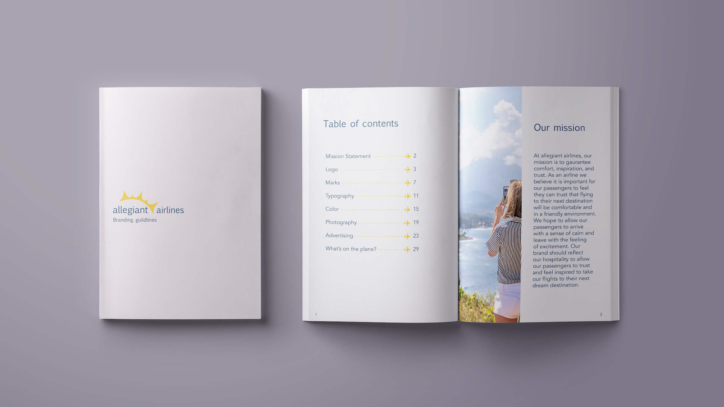
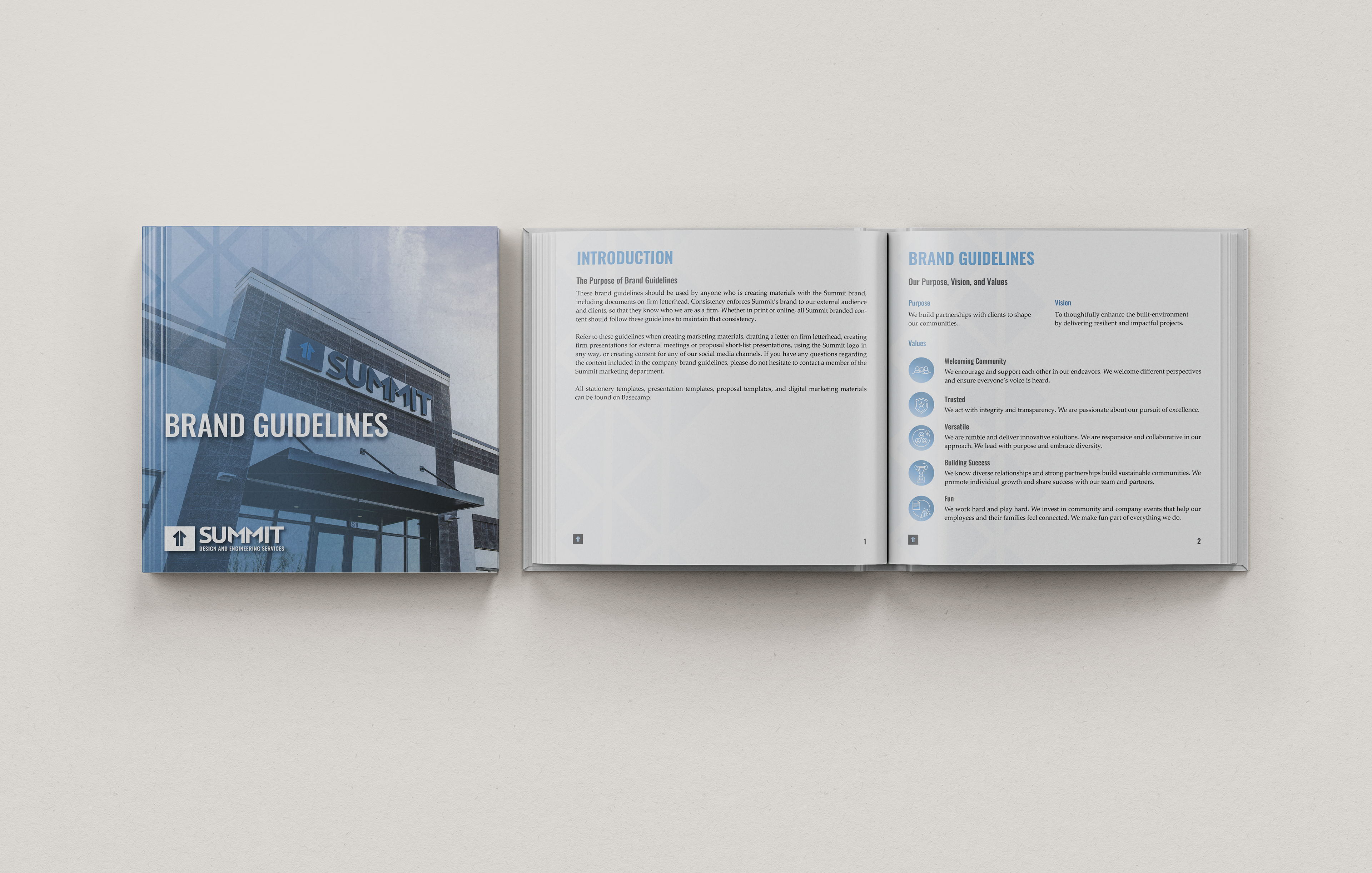
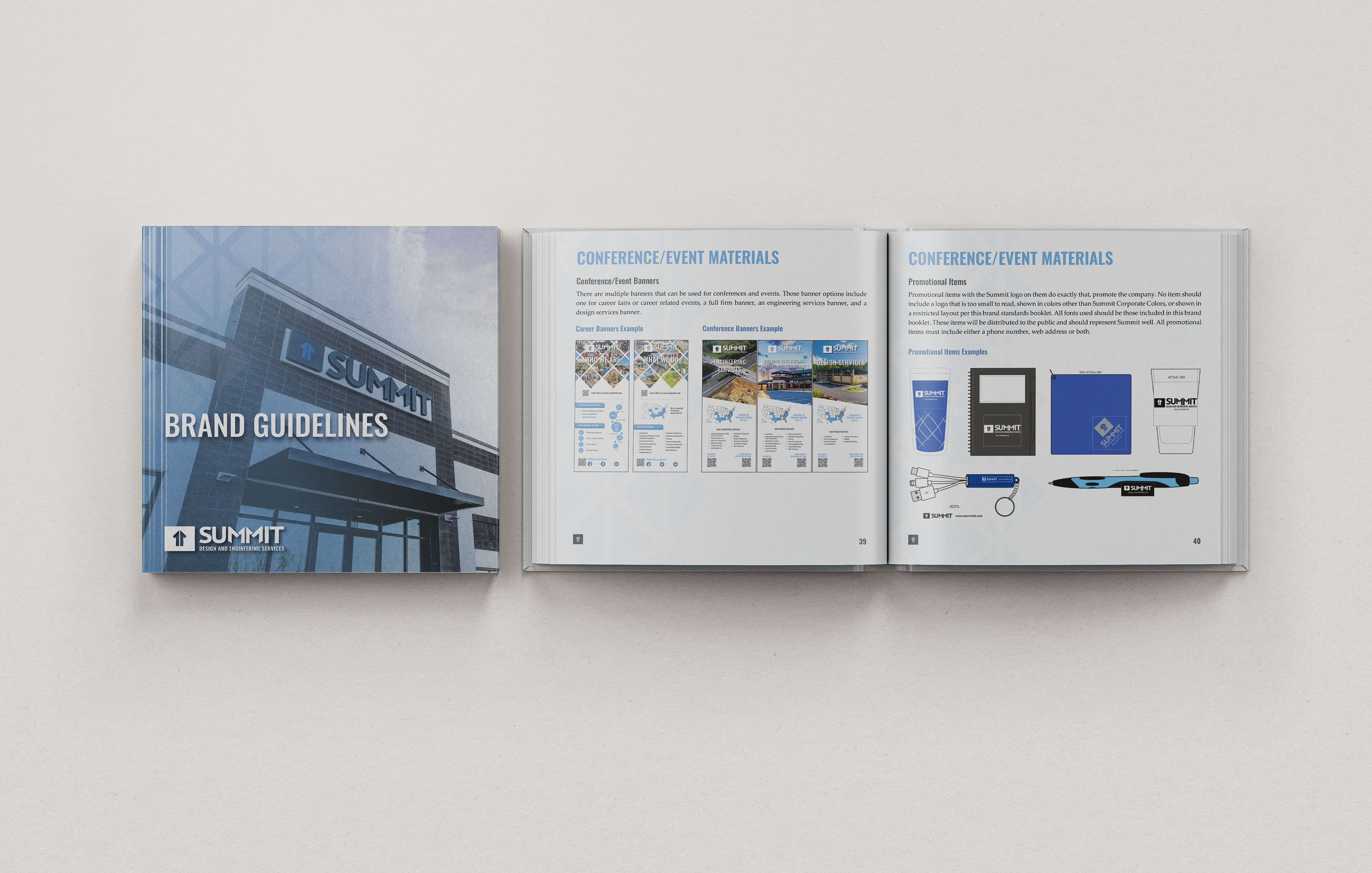
My role in this project was to evolve Summit’s existing brand standards while maintaining the integrity of its established identity. The company chose to retain its current logo, as it continued to reflect their values and market presence, but they were ready for a thoughtful visual uplift.
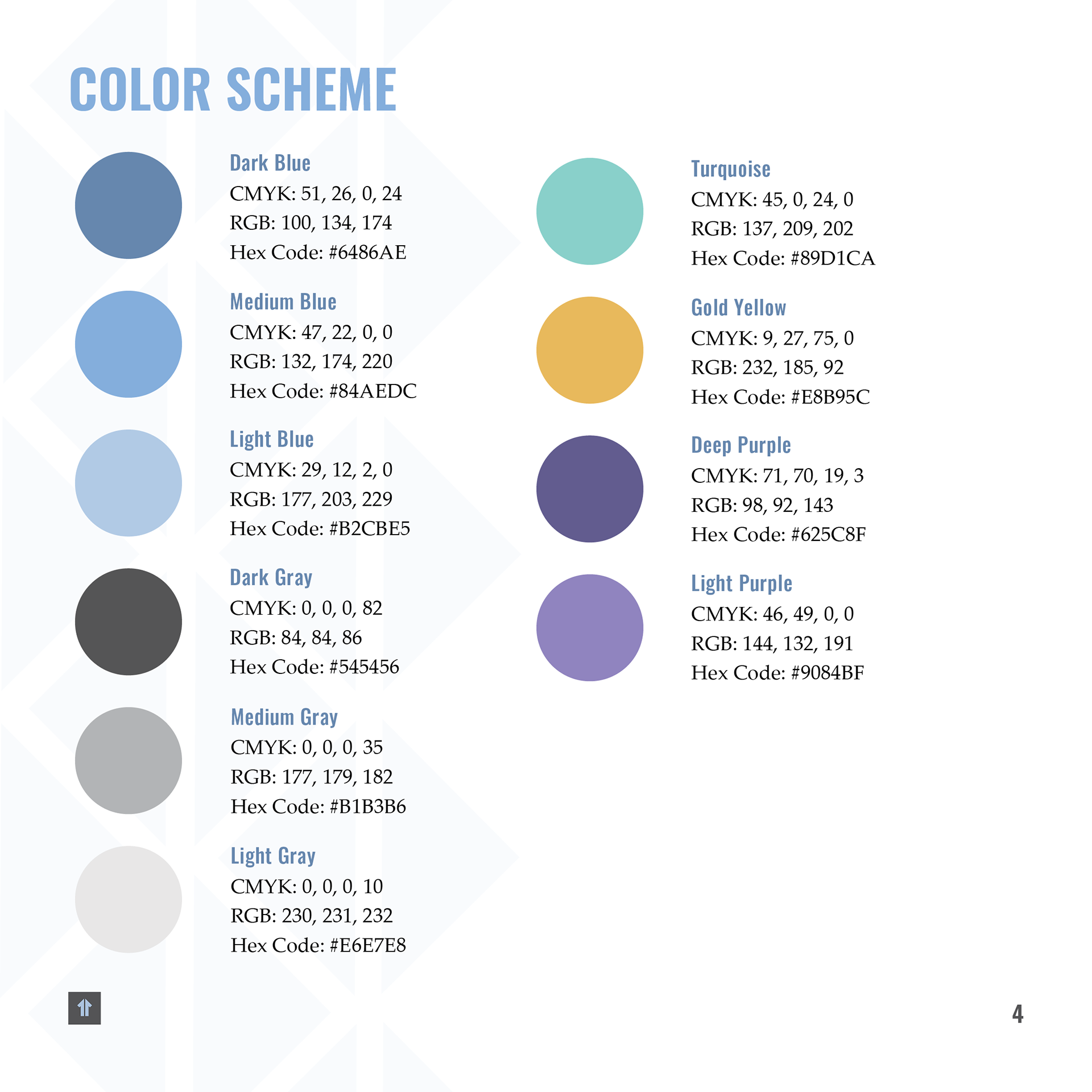
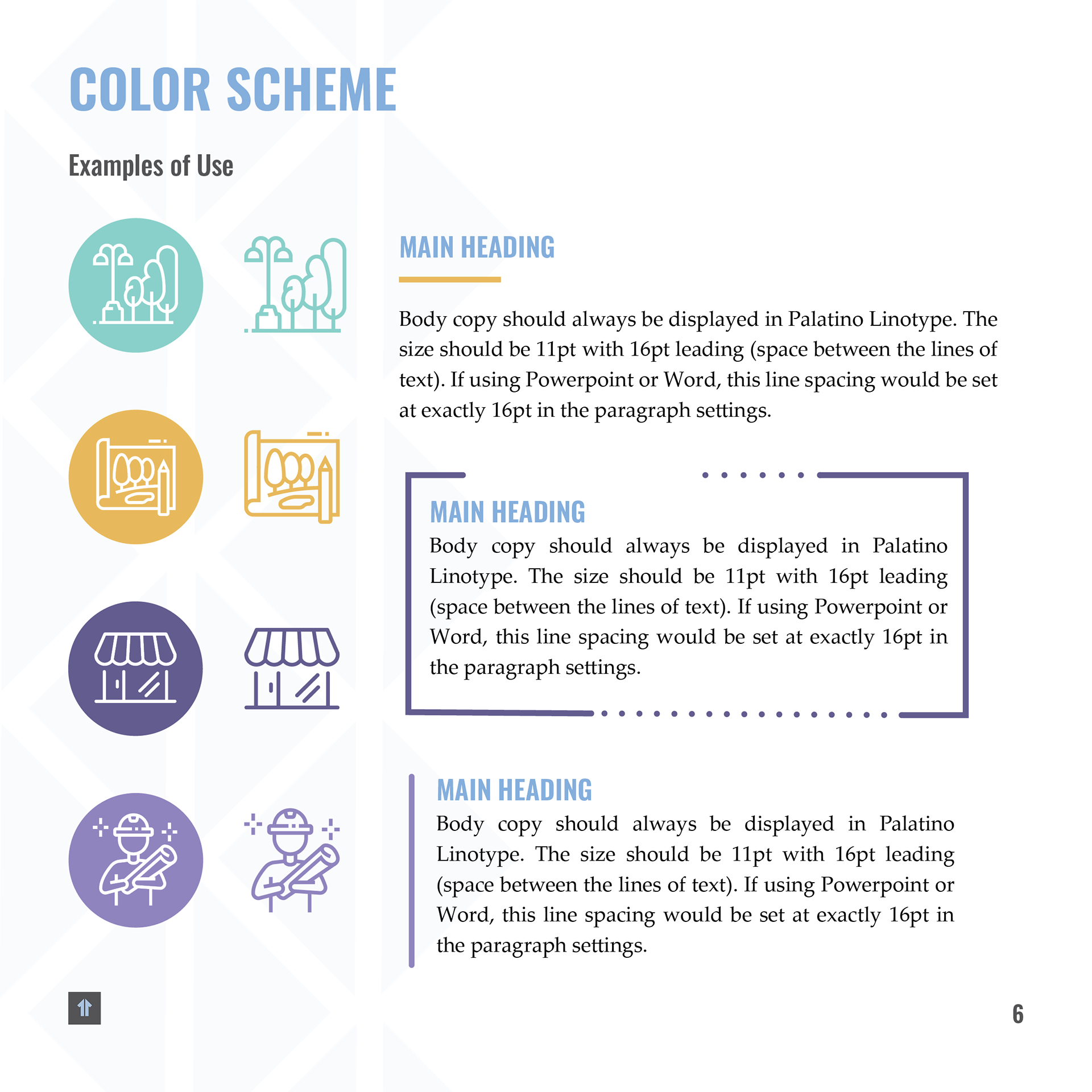
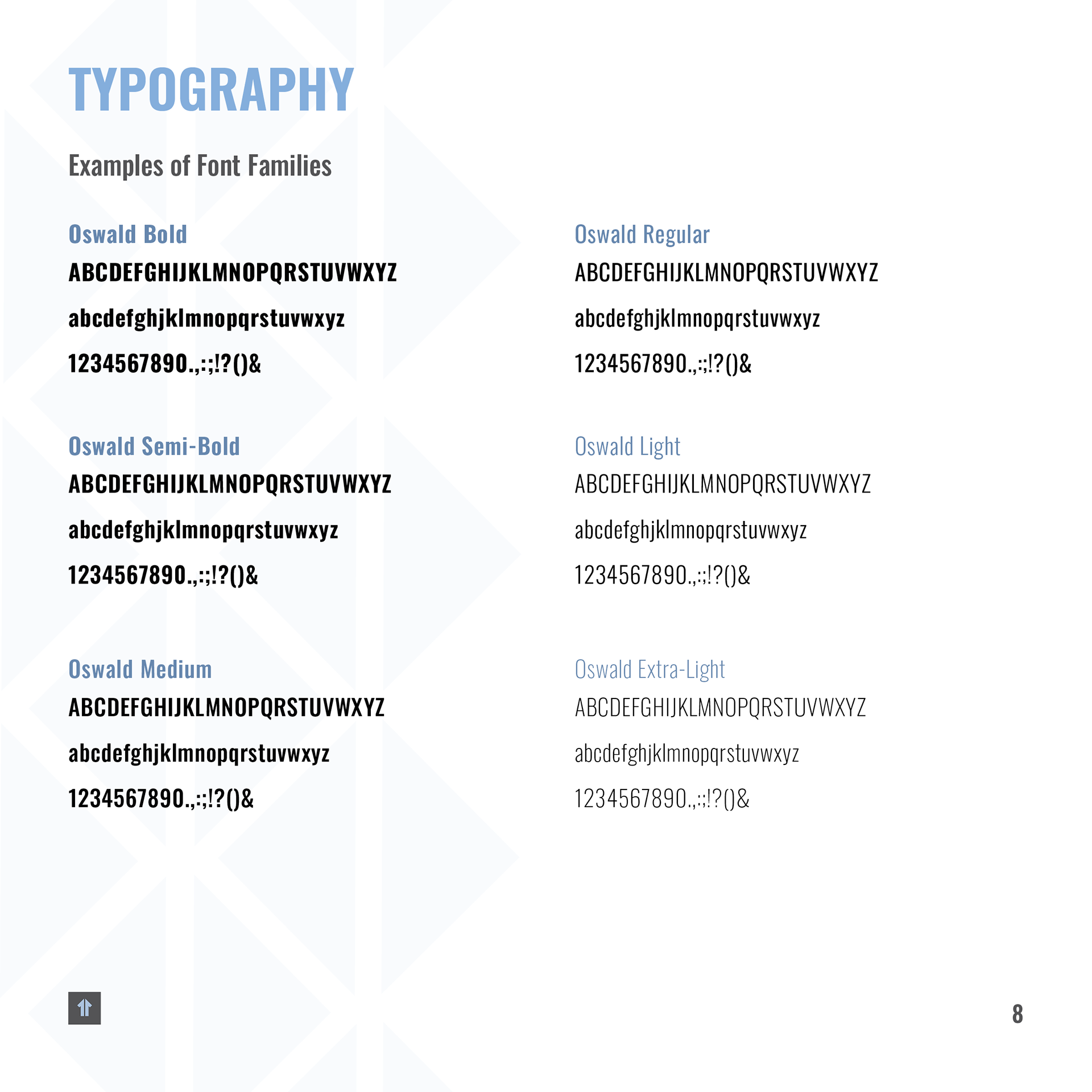
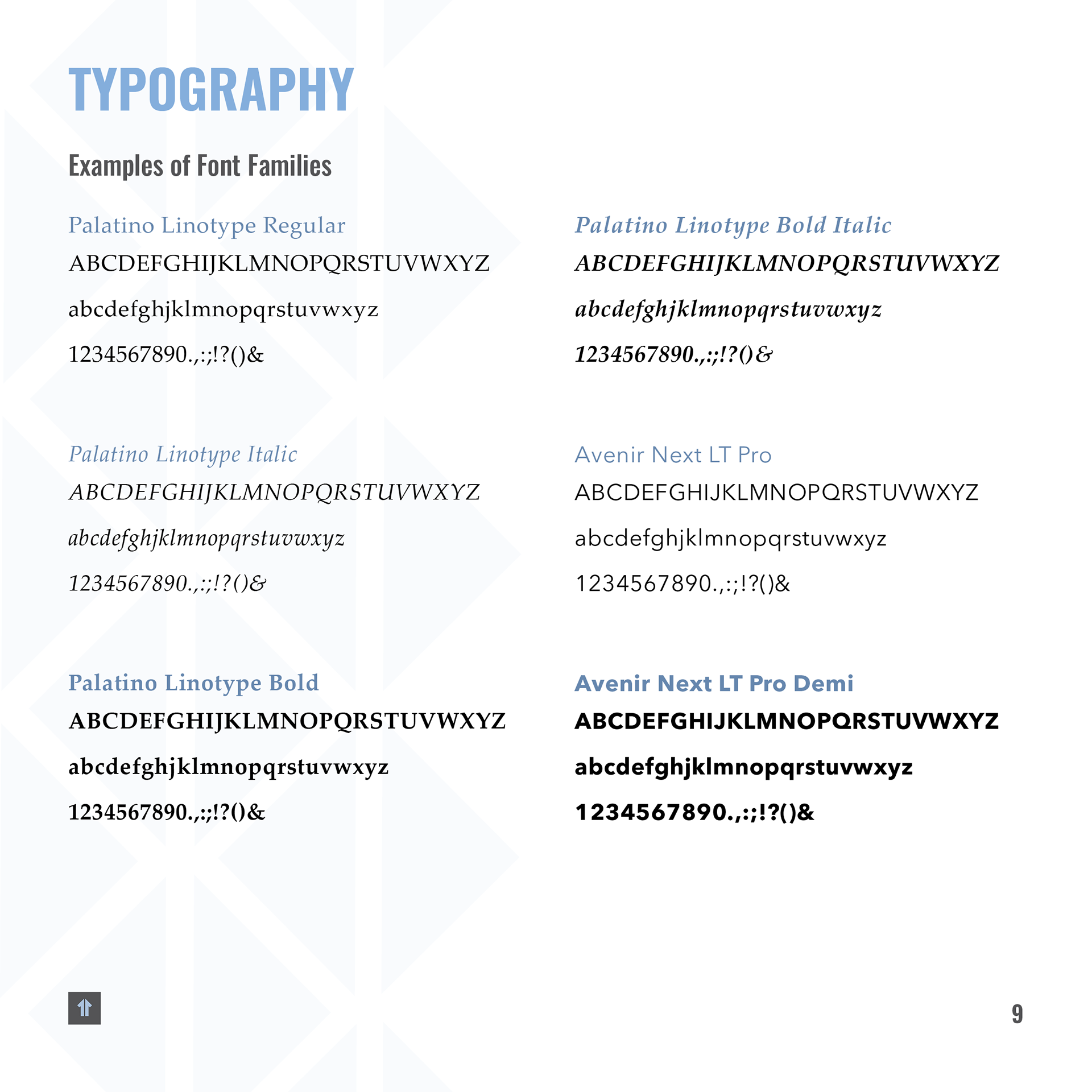
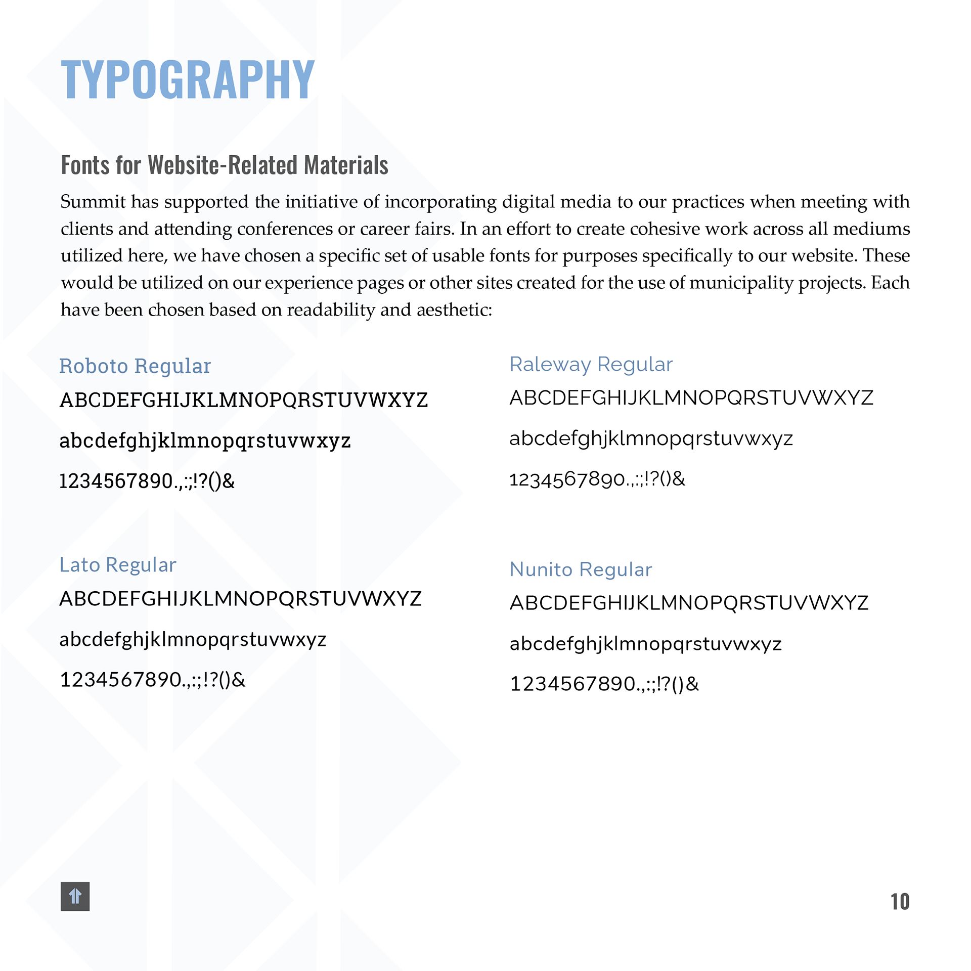
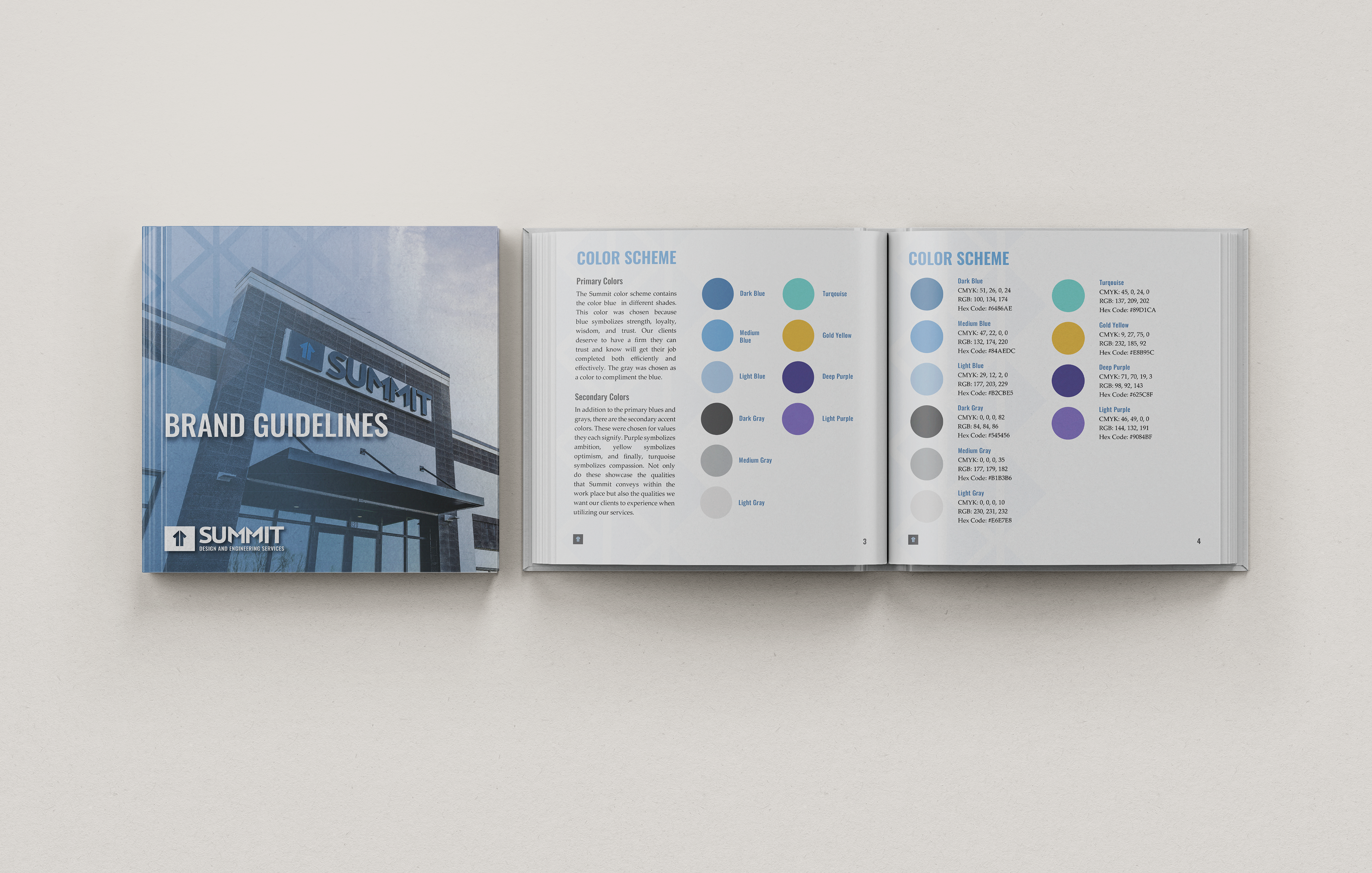
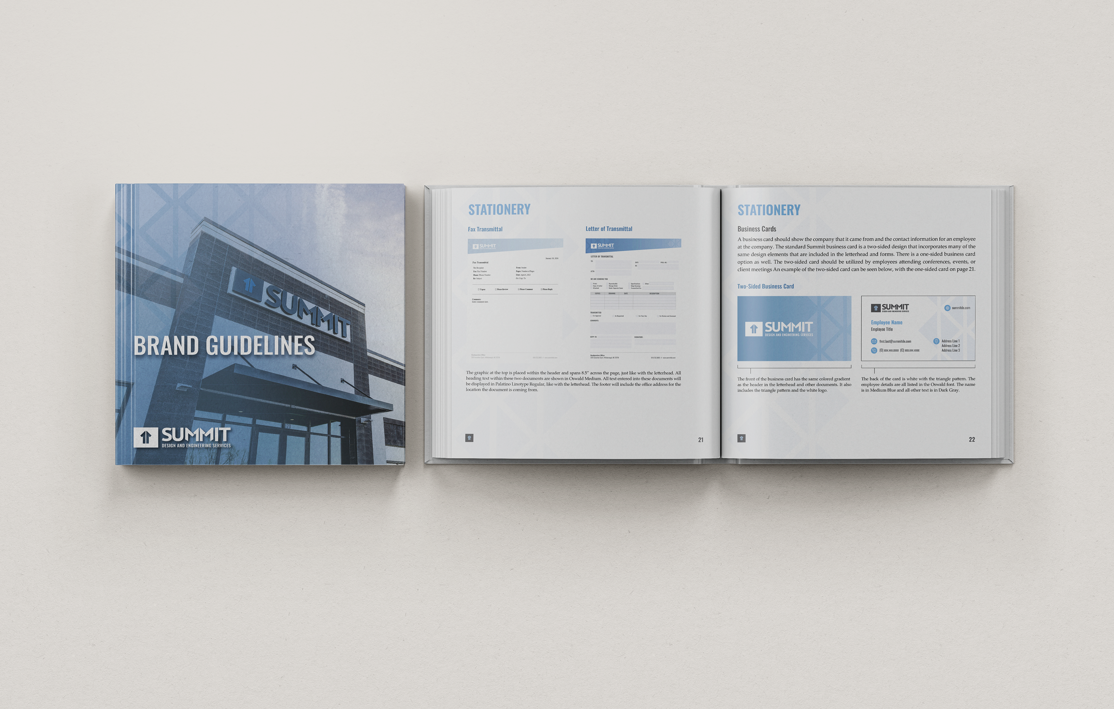
The primary objectives were to expand the color palette and replace the existing paragraph typeface, which lacked versatility and consistency across the company’s various platforms. I evaluated typography options that would function seamlessly across print, digital, and internal communications, ensuring improved usability and brand cohesion.
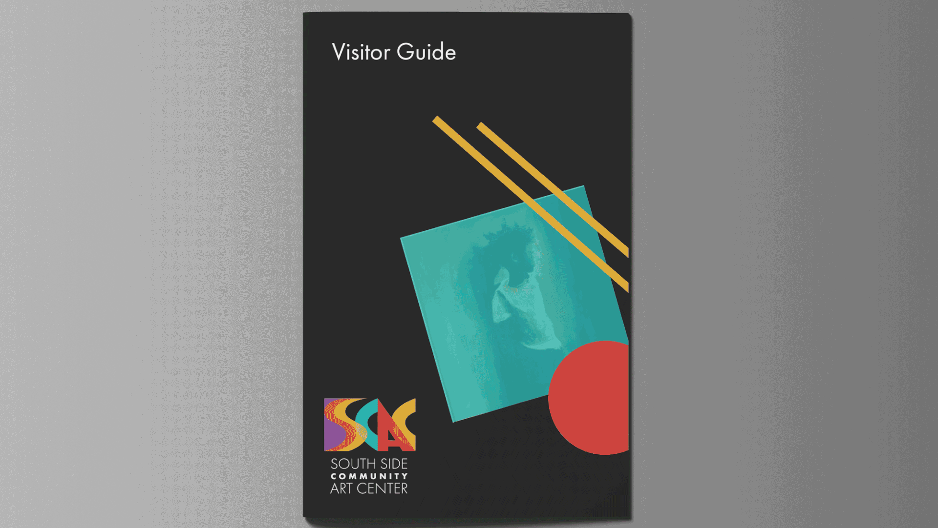
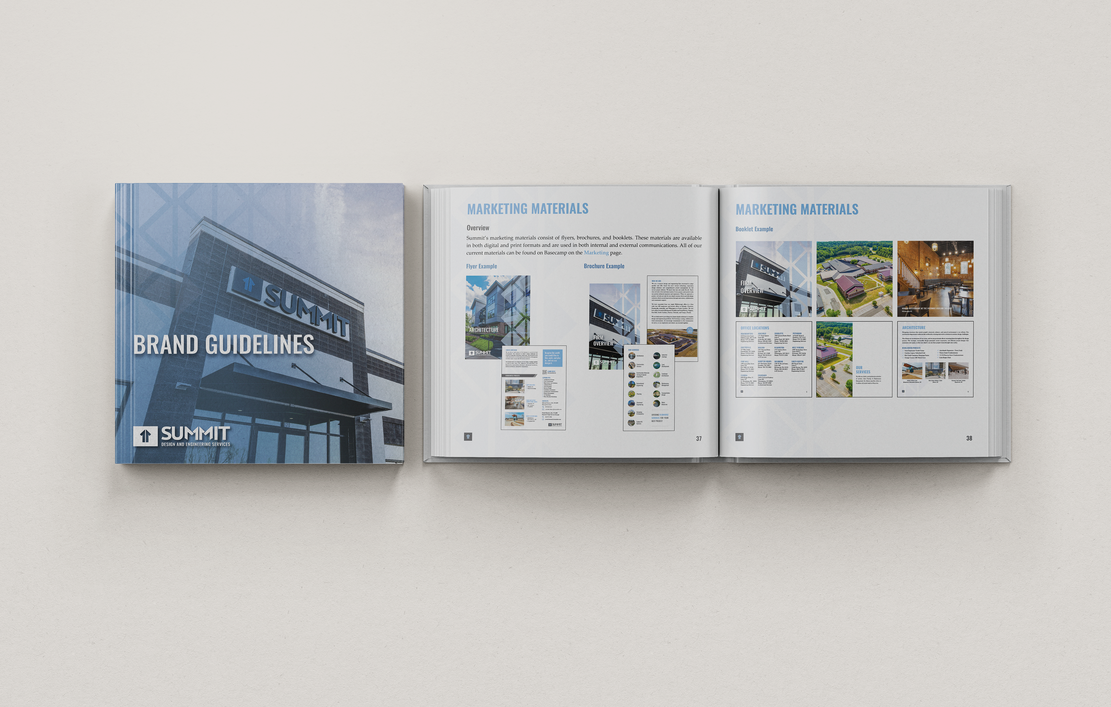
After joining Summit in 2021, I was entrusted with developing and implementing these updated brand elements. I introduced new visual styles and guidelines that are reflected in the booklet shown here, as well as across a range of branded materials. The result is a more flexible, modernized brand system that maintains recognition while enhancing consistency and scalability.