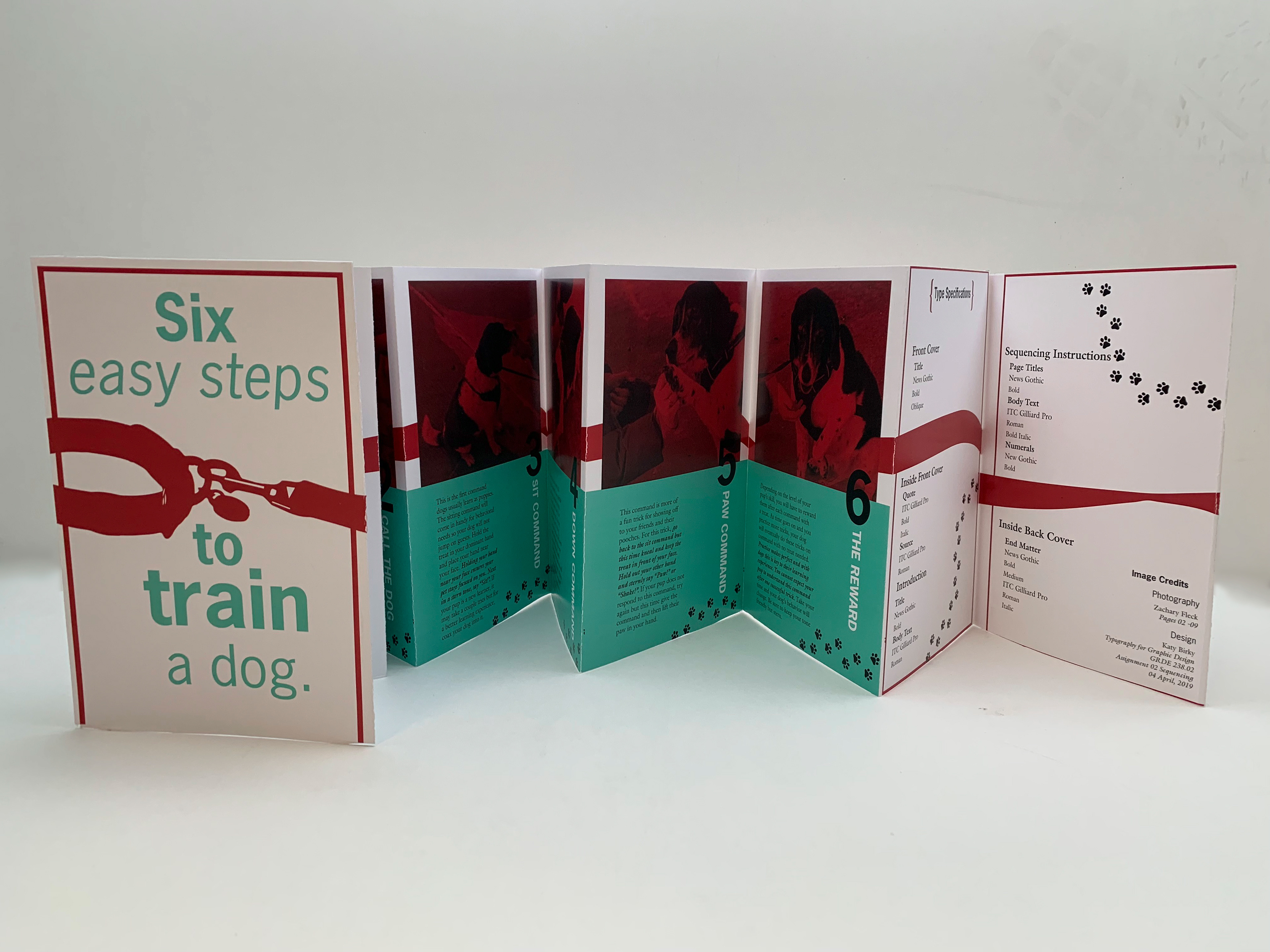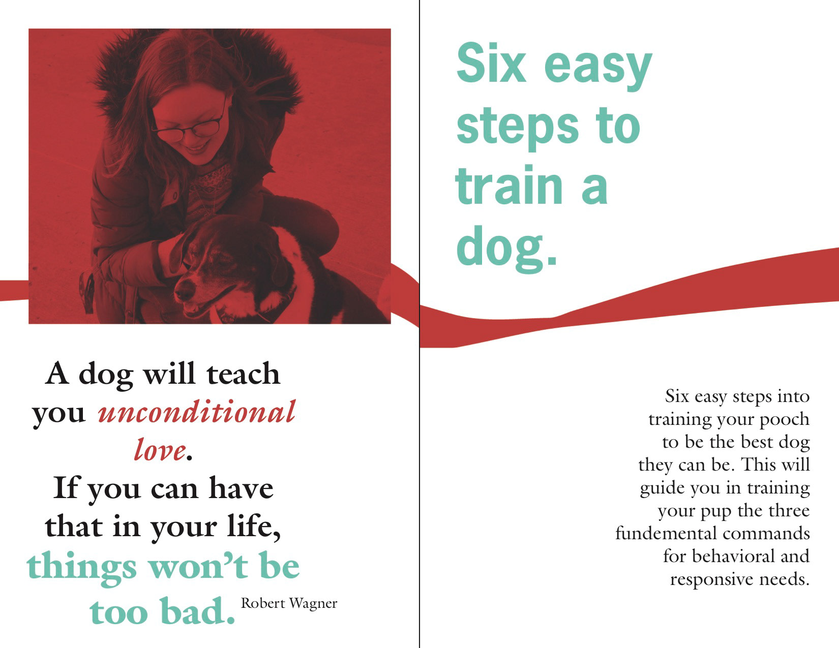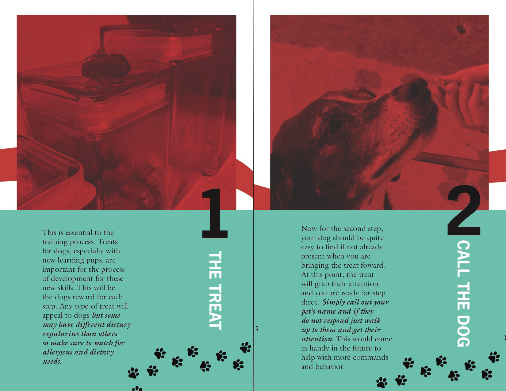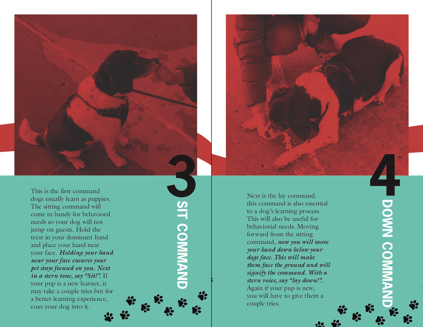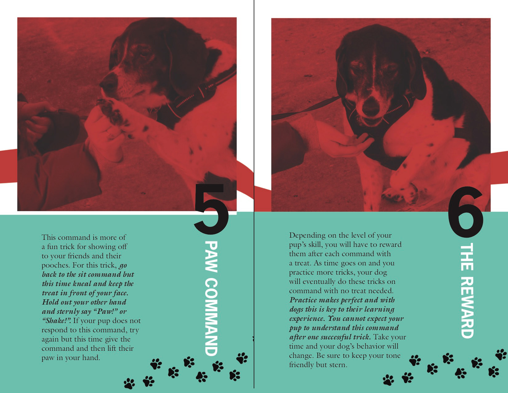
For this typography-focused project, I was challenged to design a step-by-step instructional booklet that communicated a process in six clear steps. I chose to create a guide on training a dog, breaking down the process into simple, approachable actions.
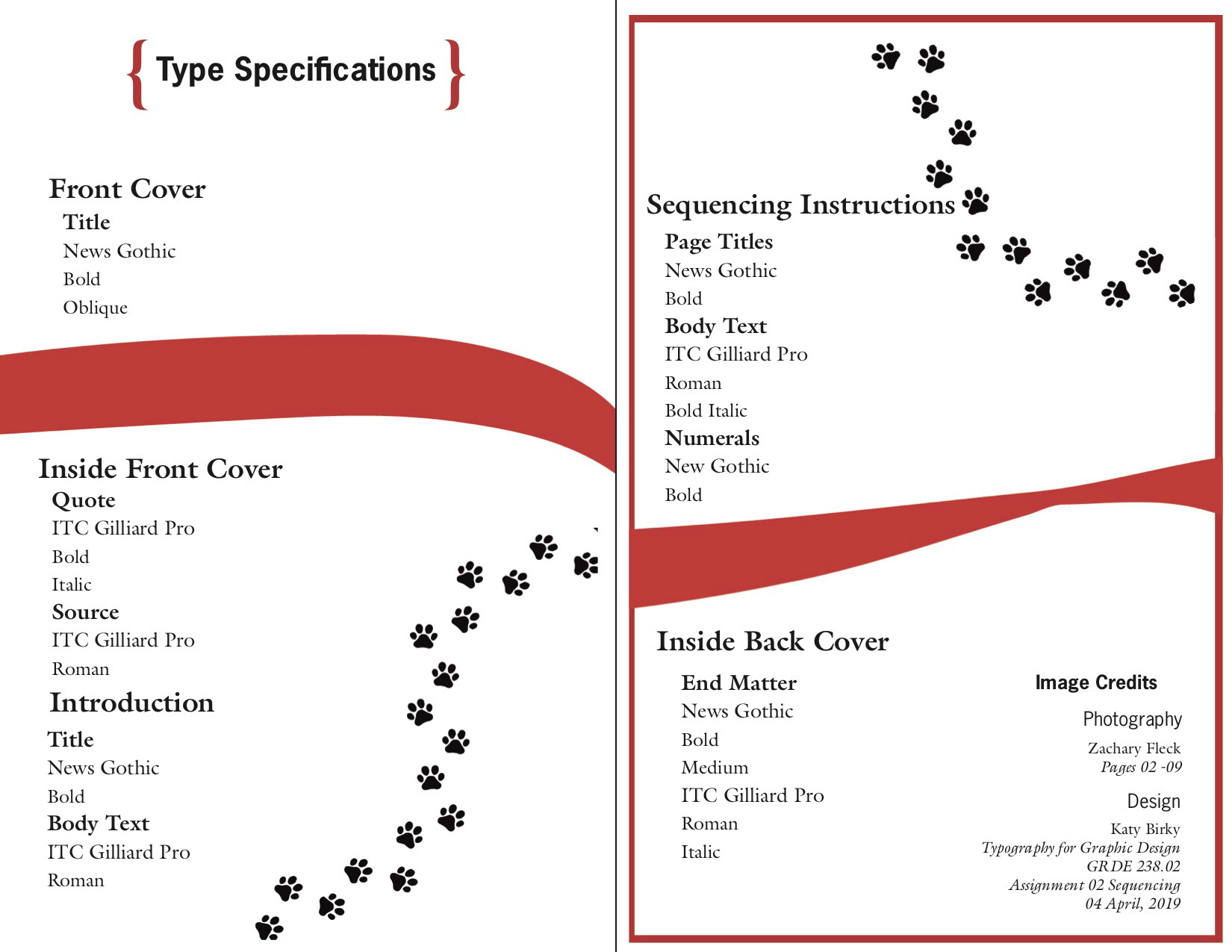
The primary goal was to use typography as the driving design element—creating hierarchy, clarity, and visual interest while maintaining a cohesive layout system. I focused on clean structure, intentional spacing, and strong typographic contrast to ensure the content felt engaging and easy to follow.
To enhance readability and visual impact, I incorporated a red and teal-blue color palette, using contrast strategically to guide the reader through each step. I also photographed my dog and myself for the booklet, integrating original imagery to add authenticity and personality to the design.
This project strengthened my understanding of typographic hierarchy, instructional design, and how thoughtful layout choices can transform a simple process into an engaging visual experience.